Logitech’s new logo looks to the Futura - Posted by mockuplove
Heavily type-influenced new brand identity for the reinvented tech company.
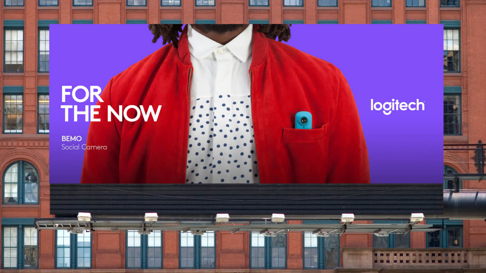
Over the last few years Logitech has been working hard to reinvigorate itself and its products, and now they’ve got a logo design and brand identity to match. Created by DesignStudio, Logitech’s vibrant new logotype – which will appear across their existing products and the new Logi line – is based around geometric shapes and pays homage to classic typefaces.
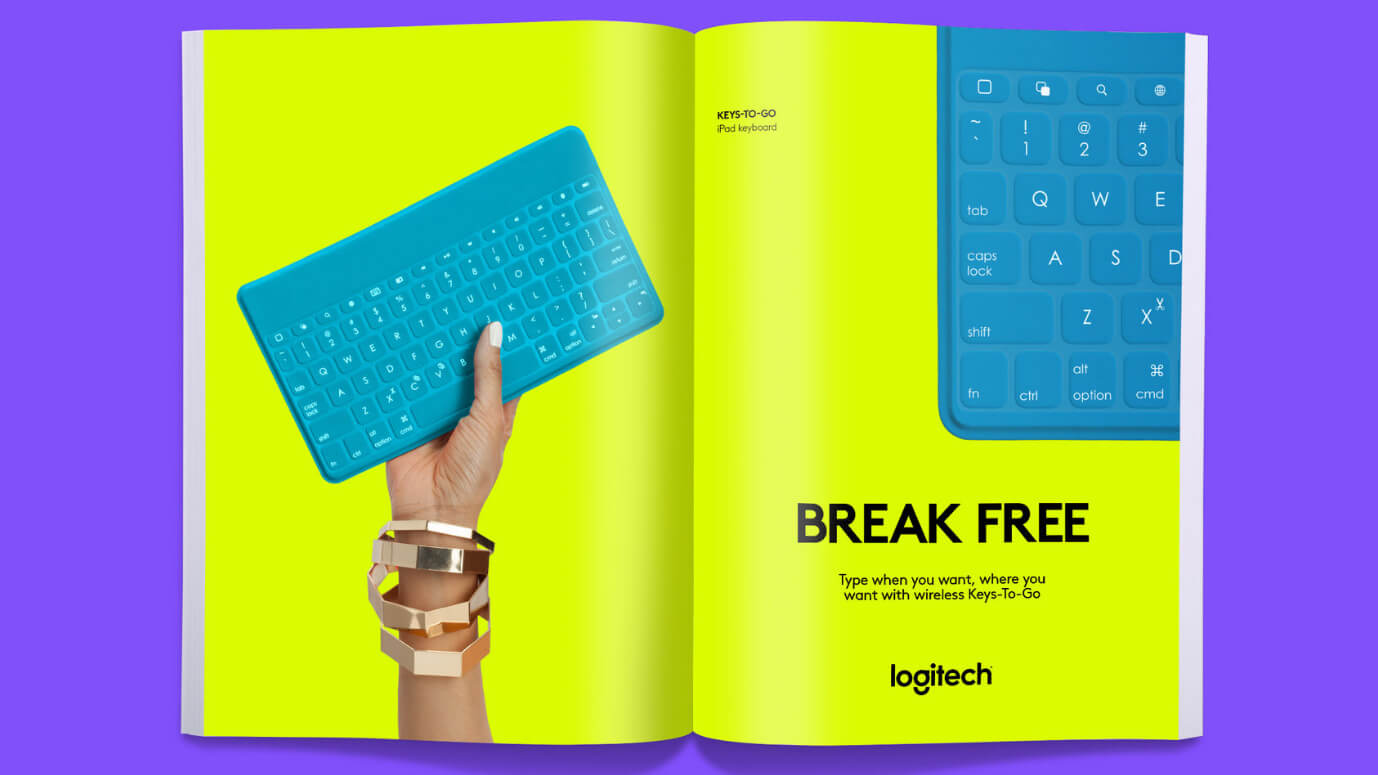
The striking, high-contrast colour schemes aim to appeal to a younger audience, who were previously unrepresented in the company’s branding. Taking its inspiration from contemporary clothing, the blocks of bright colours continue a trend for bold logo schemes seen, in particular, in DesignStudio’s treatment for the FA Premier League brand.
Thankfully the identity is considered and refined, rather than cashing in its dignity to try and be down with the kids. The logotype makes use of the Brown Pro typeface which is a reference to Logitech’s birthplace and 30-year heritage, while the logo itself harks back to Paul Renner’s design sketches for the ‘Futura’ typeface.
Logitech’s innovative products now have a suitable identity
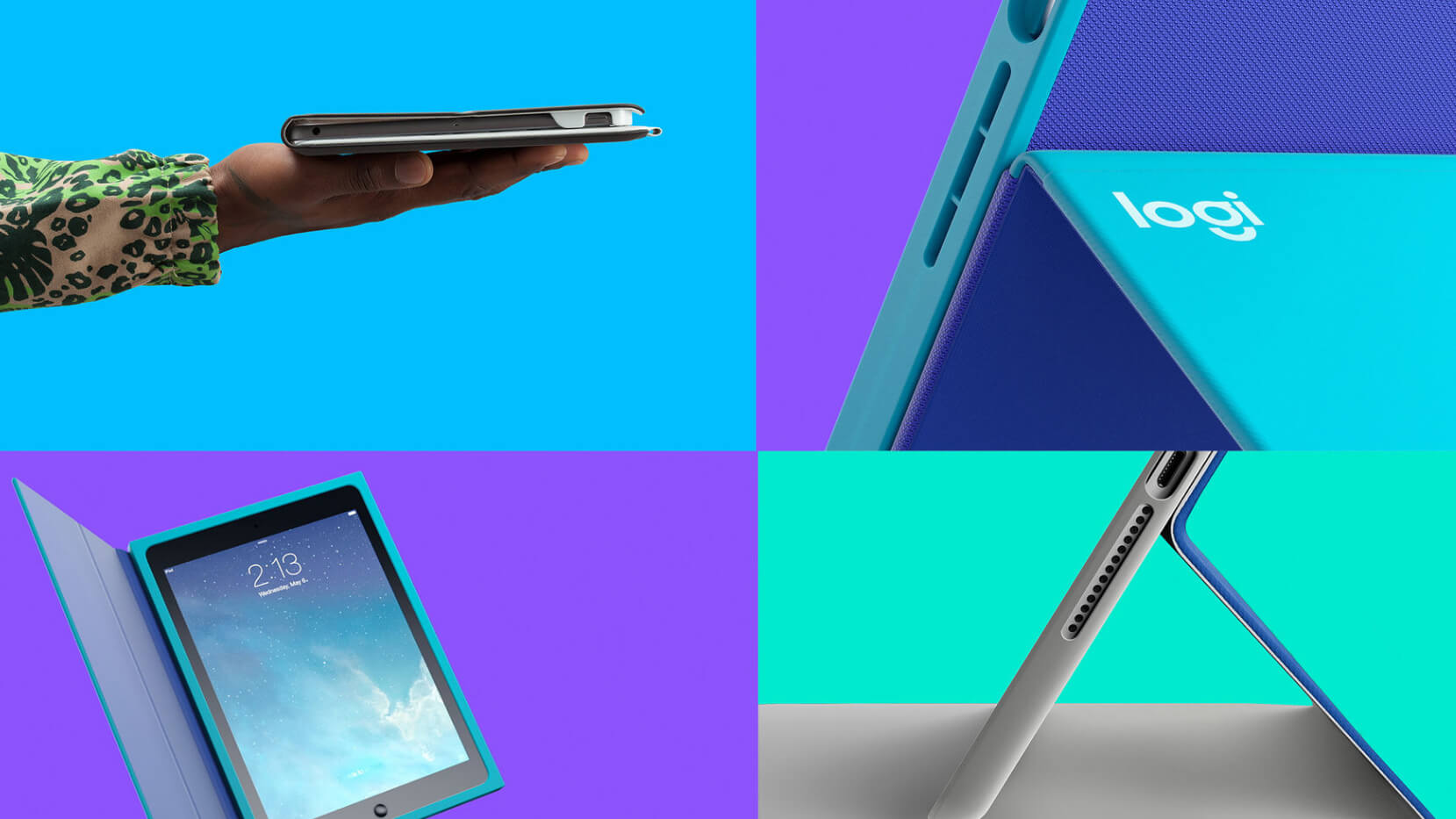
The new identity will appear on the Logi range
Bright modern clothing inspired the rebrand
By working closely with Logitech’s global team, DesignStudio will continue to evolve the company’s image by working with them on art direction and guidelines. Expect to see the new identity appear in shops, on packaging, and even on icons.
ABOUT THE AUTHOR
Dom Carter